
How to Interpret a Histogram: A Step-by-Step Guide
Histograms are visual representations of data distribution. Here’s how to interpret them effectively:-

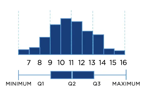
Once you plot your histograms for your one or several variables you are looking for three big things:
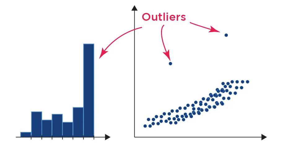
What is the shape, is there a skew, are there any outliers ?
The first big question asks about shape.
When you make predictions, it is often an assumption that your data points are normally distributed. Rather than just make the assumption, you can visually check your data using a histogram.
If the histogram has a central peak and is roughly symmetric, then you have a fairly normal set of data points. If not, you can determine which types of data transformations are needed to fit the normality assumption.
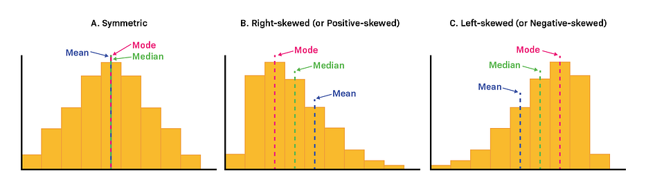
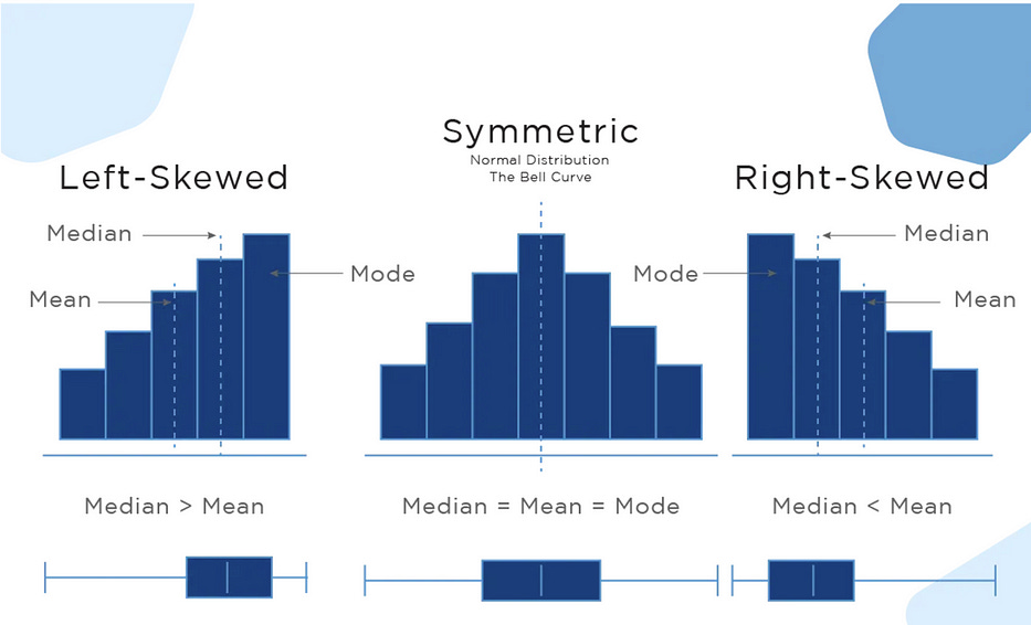
The second big question asks about skews.
If the distribution is almost normal, but one tail seems to drag on longer than the other side, then your data is probably skewed.
More Precisely,
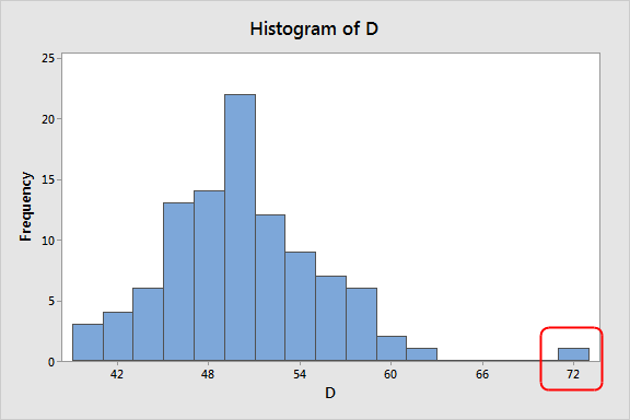
The third question, do you have outliers ?
Outliers can cause skews because they create a tail on our histogram. If we can see an outlier in our histogram and we know that it is not a valid point (think of having a negative height) then we know that we should probably clean up our data to ignore the outliers.
Precisely,
More use cases in DataScience:-
Central Tendency:
Histograms can be used to find the center of data samples, in the histogram given below, we can see the center of the data sample is between ‘-1 and 0’.
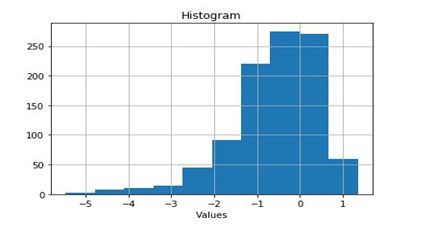
The Center of data is actually ‘mean’. In other words, histograms give information about the ‘mean’ of data.
Variability:
Summary statistics can create a false concept of data distribution.
Suppose you have two data distributions and the only thing known about those is their ‘mean’. If the mean of both data distributions is the same then this information will lead us to believe that both distributions are practically equivalent.
However, if we graph those data distributions, we’ll find out that both distributions are not equivalent rather they are different, as shown below:
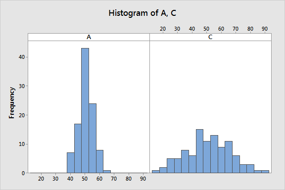
As we can see that both distributions (A & C) are notably different although both have the same mean value. Distribution A ranges from (40 to 70) while distribution C ranges from (10 to 90). Thus, “mean” doesn’t provide the complete picture of our data and can be misleading.
Summary statistics, such as mean & standard deviation, only offer partial information, while histograms give us more material to understand which values are more or less common in data.
Best practices for using a histogram

Use a zero-valued baseline
An important aspect of histograms is that they must be plotted with a zero-valued baseline. Since the frequency of data in each bin is implied by the height of each bar, changing the baseline or introducing a gap in the scale will skew the perception of the distribution of data.
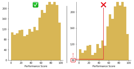
Trimming 80 points from the vertical axis makes the distribution of performance scores look much better than they actually are.
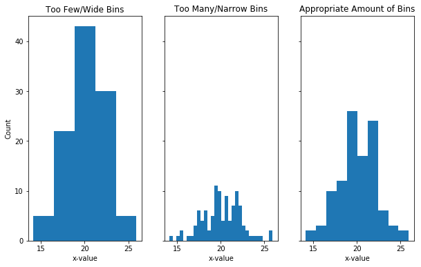
Selection of Bin Size
The choice of the size of bins is very important, as wrong bin size can mislead the conclusion draw form the visualization.
Bins represent the ranges over which you are counting and the size of your bins has an impact on the shape of your histogram. If you have a large bin size (smaller number of bins) and you can hide important information by over-grouping.
If you have a narrow bin size (lots of bins), this can create too much noise and it is, therefore, harder the get useful information. In this case, you are getting too close to that bar chart situation where you are being too specific in your graph. Luckily in python, there is a bins argument that allows you to determine how many bins you want, so you can play around with different values to make sure you collect the correct shape of your data.
Too few bins can hide peaks. Too many bins can make it hard to interpret histogram and It is always a good to try different bin sizes to be sure that you are not missing something important.
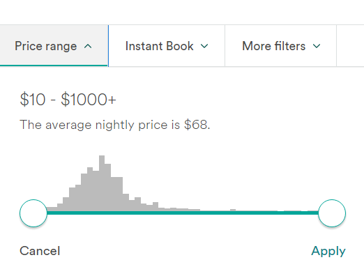
How Frequently I use Histograms almost daily 😁
In 2024, I embarked on an incredible journey, traveling from France to India by road. The adventure spanned over 136 days and took me across more than 17 countries. As you can imagine, such a long trip, especially through Europe, could be quite expensive. To manage my expenses, I relied heavily on Airbnb accommodations where I could cook my own meals.
But here’s the interesting part — it’s not just about traveling or cooking. It’s about selecting the right price range on Airbnb. If you’ve used Airbnb, you might have noticed that the price range selection feature resembles a histogram. This small yet powerful data visualization tool played a crucial role in helping me make budget-friendly decisions throughout my journey.
Final Note
I hope my article was helpful to you. If you have anything to contribute to this article, don’t be afraid to leave a comment. I genuinely value any suggestions you may have. Thank you!
Connect with me on LinkedIn, and I’d appreciate a review on Google 🤓
Subscribe this if you want my blogs in your Inbox every Thursday 👍
If you love reading this blog, share it with friends! ✌️
For training inquiries, be it Tableau, Power BI, SQL, Alteryx, Python, Machine Learning, Deep Learning drop me an email at tarunsachdeva7997@gmail.com or tarun@thadatamantra.com